10 data analytics dashboards with Matplotlib
Telling a story with Matplotlib in Python

If your data doesn't provide your business actionable insights, it's useless!
Anyone can show numbers and statistics on a graph. But what significance do these number have for the business? What makes those numbers interesting, is a relevant story behind it. Every aspiring Data Analyst or a Business Intelligence Developer needs to learn the art of story telling.
In this article, we will focus on 10 commonly used visualizations or plots using Matplotlib in Python. These plots are not mere graphs! Each plot, tells a story about a real-life scenario and corresponds to common dashboards used by Data Analysts and Management team in various companies to take actionable insights.
10 Data Analytics dashboard examples with Matplotlib
The 10 plots and problem scenarios discussed in this article are:-
- Line Chart - How has the news paradigm in India shifted over the last 10 years?
- Stacked Area Chart - What is the total sales generated by an MNC across all its market during last year?
- Bar Chart - What is the YoY(Year-on-Year) monthly sales comparison for a company?
- Pie Chart - What was the approval % of a bill introduced in the winter session of Parliament?
- Scatter Plot - How does the rent of a house vary with the house size?
- Bubble chart - How deadly(fatality rate) and widespread(number of fatalities) is a particular disease?
- Candlestick - How has Nifty 50 performed on the National Stock Exchange in the month of October?
- Timeseries - What is the distribution of "Close" value of Nifty 50 for the last 1 year?
- Histograms - What is the gender-wise distribution of students' height in a school?
- Heatmap - What is the Monthly Recurring Revenue(MRR) retention of a company?
Attention! This article is only intended to show readers different concepts and tricks to plot useful graphs in Python using the Matplotlib library. The data shown in the following graphs is unreal and is not intended to depict the truth on the ground.
Line chart
A line chart displays information as a series of data points connected by a straight line. It allows you to track changes in the value of an entity over time.
Line charts are useful to show trends of how a certain thing changes over a period. The below example uses line charts to show how the primary source of news has changed among Indians over the last decade.
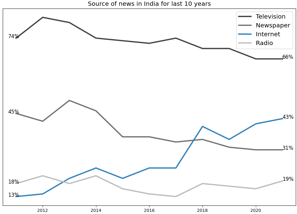
Important points
- No y axis labels are shown in the graph - Use the
set_visible()function. - The first and last data point for every news medium is shown - Use
plt.text()function.
Check out the code below to build this line chart.
import matplotlib.pyplot as plt

fig, ax = plt.subplots(figsize=(5, 4),
                   constrained_layout=True)

# Sets y-axis visibility to False
ax.yaxis.set_visible(False)

xData = [
  [2011, 2012, 2013, 2014, 2015, 2016, 2017, 2018, 2019, 2020, 2021],
  [2011, 2012, 2013, 2014, 2015, 2016, 2017, 2018, 2019, 2020, 2021],
  [2011, 2012, 2013, 2014, 2015, 2016, 2017, 2018, 2019, 2020, 2021],
  [2011, 2012, 2013, 2014, 2015, 2016, 2017, 2018, 2019, 2020, 2021]
]

yData = [
  [74, 82, 80, 74, 73, 72, 74, 70, 70, 66, 66],
  [45, 42, 50, 46, 36, 36, 34, 35, 32, 31, 31],
  [13, 14, 20, 24, 20, 24, 24, 40, 35, 41, 43],
  [18, 21, 18, 21, 16, 14, 13, 18, 17, 16, 19]
]

labels = ['Television', 'Newspaper', 'Internet', 'Radio']

colors = ['#434343', '#737373', '#3182bd', '#bdbdbd']

font_style = dict(size=12, color='black')

for data in zip(xData, yData, labels, colors):
    ax.plot(data[0],
            data[1],
            label=data[2],
            color=data[3],
            linewidth=3)

    # Annotate first and last data point
    ax.text(data[0][0] - 0.3,
            data[1][0],
            str(data[1][0])+'%',
            **font_style)

    ax.text(data[0][-1],
            data[1][-1],
            str(data[1][-1])+'%',
            **font_style)

plt.legend(fontsize='x-large')
plt.title('Source of news in India for last 10 years',
          fontsize='x-large')
plt.ylabel('% of respondents', fontsize='x-large')
plt.show()
Stacked Area Chart
A stacked area chart displays the change in KPI for different of a dataset. Each group is displayed on top of each other, making it easy to deduce not only the total value, but also the contribution of each group.
For example, an important analysis could be measuring and comparing a company's sales across all its marketing countries. In such scenarios, having a grid layout could be useful in figuring out the approximate sales numbers for each country.
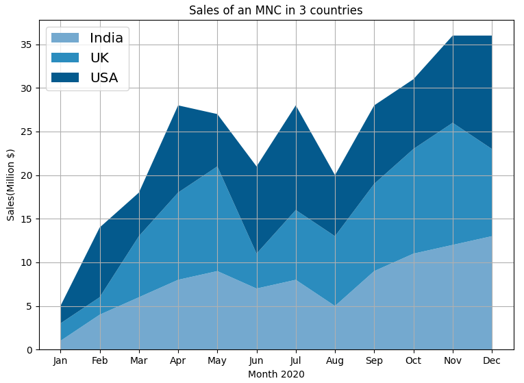
To reproduce the above graph or create a similar graph, use the code below.
import numpy as np
import matplotlib.pyplot as plt

# Create data
months = ['Jan', 'Feb', 'Mar', 'Apr', 'May', 'Jun', 'Jul', 'Aug', 'Sep', 'Oct', 'Nov', 'Dec']
india_sales = [1, 4, 6, 8, 9, 7, 8, 5, 9, 11, 12, 13]
uk_sales = [2, 2, 7, 10, 12, 4, 8, 8, 10, 12, 14, 10]
usa_sales = [2, 8, 5, 10, 6, 10, 12, 7, 9, 8, 10, 13]

COLORS = ["#74A9CF", "#2B8CBE", "#045A8D"]

# Basic stacked area chart.
plt.stackplot(months, india_sales, uk_sales, usa_sales, colors=COLORS, labels=['India','UK','USA'])
plt.legend(loc='upper left', fontsize='x-large')
plt.grid(True)

plt.xlabel('Month 2020')
plt.ylabel('Sales(Million $)')
plt.title('Sales of an MNC in 3 countries')

plt.show()
Bar chart
A bar chart shows the relationship between a numerical and a categorical variable. The categorical variable is represented as a bar. The size of the bar represents its numerical value.
The below example uses bar charts to compare Year-on-Year monthly sales of a company.
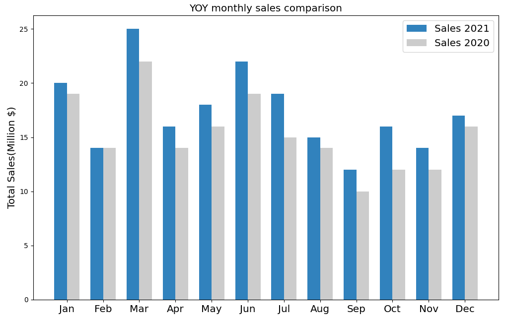
You can recreate the above graph using the code below. Pay attention to how the width of the bars are fixed in the code and the x-axis labels are aligned to the centre.
import matplotlib.pyplot as plt
import numpy as np

months = ['Jan', 'Feb', 'Mar', 'Apr',
          'May', 'Jun', 'Jul', 'Aug',
          'Sep', 'Oct', 'Nov', 'Dec']

sales_2020 = [19, 14, 22, 14, 16, 19, 15, 14, 10, 12, 12, 16]
sales_2021 = [20, 14, 25, 16, 18, 22, 19, 15, 12, 16, 14, 17]

x = np.arange(len(months))  # the label locations
width = 0.35  # the width of the bars

fig, ax = plt.subplots(figsize=(5, 4), constrained_layout=True)

font_style = dict(size=12, color='black')

rects1 = ax.bar(x - width/2, sales_2021, width,
          label='Sales 2021', color='#3182BD')
rects2 = ax.bar(x + width/2, sales_2020, width,
          label='Sales 2020', color='#CCCCCC')

ax.set_xticks(x)
ax.set_xticklabels(months, fontsize='x-large')
fig.tight_layout()
plt.legend(fontsize='x-large')
plt.title('YOY monthly sales comparison', fontsize='x-large')
plt.ylabel('Total Sales(Million $)', fontsize='x-large')
plt.show()
Pie chart
A Pie Chart is a circle divided into categorical variables, each representing their value as a numeric percentage of the whole. Although they are not the best plotting choice if you want to know the actual percentages of each entity, especially when you are plotting a lot of entities, they do provide a general understanding of the each entity's contribution to the whole.
The below graph provides an analysis of the approval % of a new bill introduced in the winter session of parliament.
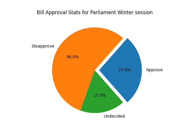
Notice how the approval share has been exploded out for better clarity. To reproduce the above pie chart or create a similar plot, use the code below.
import matplotlib.pyplot as plt
import numpy as np

# pie chart parameters
ratios = [.27, .56, .17]
labels = ['Approve', 'Disapprove', 'Undecided']
explode = [0.1, 0, 0]
# rotate so that first wedge is split by the x-axis
angle = -180 * ratios[0]
plt.pie(ratios, autopct='%1.1f%%', startangle=angle,
        labels=labels, explode=explode)
plt.title("Bill Approval Stats for Parliament Winter session")
plt.show()
Scatter Plot
A scatter plot shows the relationship between 2 numerical variables. You can use any kind of marker to create a scatter plot.
The below graph shows the relationship between size of a house and it's rent.
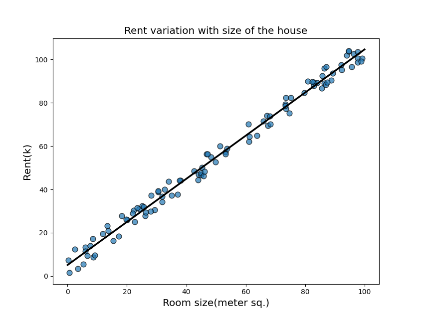
You can also see a straight fit line (through linear regression). You can use numpy.polyfit() function to draw the regression line. Use the code below to recreate the above plot.
import matplotlib.pyplot as plt
import numpy as np

#random number generator
seed = np.random.default_rng(1234)

x = seed.uniform(0, 10, size=100)
y = x + seed.normal(size=100)

# Initialize layout
fig, ax = plt.subplots(figsize = (9, 9))

# Add scatterplot
# Use the marker parameter to choose
# an appropriate marker
ax.scatter(x, y, s=60, alpha=0.7, edgecolors="k")

# Fit linear regression via least squares with numpy.polyfit
# It returns a slope (b) and intercept (a)
# deg=1 means linear fit
b, a = np.polyfit(x, y, deg=1)

# Create sequence of 100 numbers from 0 to 100
xseq = np.linspace(0, 10, num=100)

# Plot regression line
ax.plot(xseq, a + b * xseq, color="k", lw=2.5)
plt.title('Rent variation with number of rooms', fontsize='x-large')
plt.ylabel('Rent(k)', fontsize='x-large')
plt.xlabel('Number of rooms', fontsize='x-large')

plt.show()
Bubble chart
A bubble chart is kind of a scatter plot. Based on a third numerical variable, the size of each bubble is determined. This shows the weight of that particular variable in the dataset.
The plot below compares the fatality rate(deadliness) vs the total number of fatalities for different diseases.
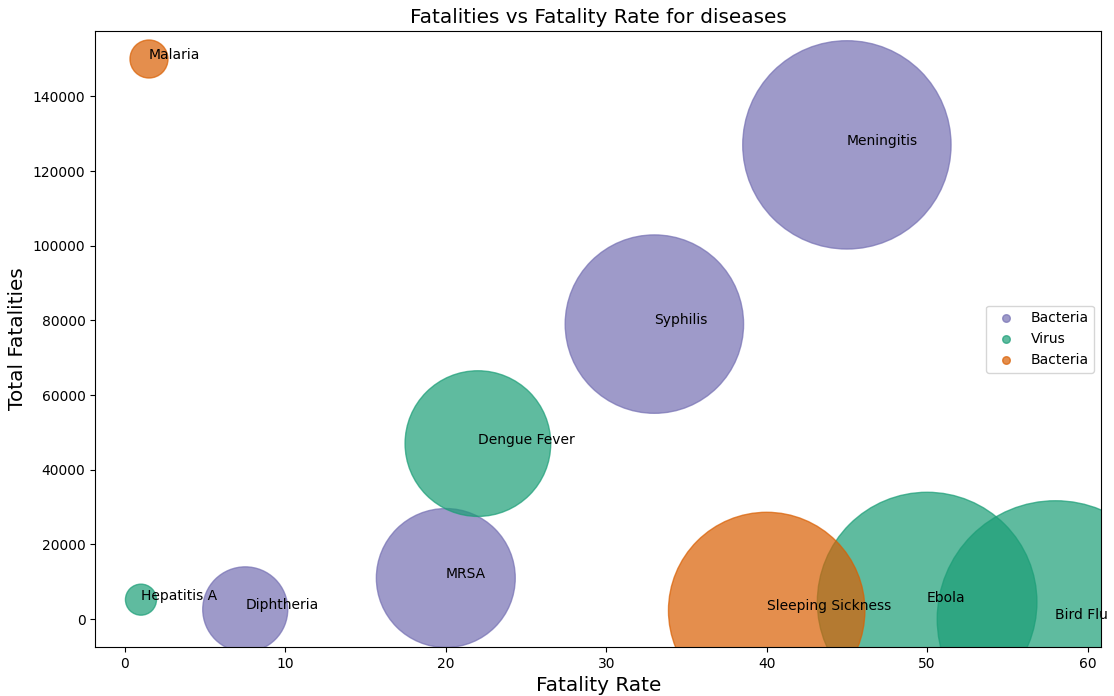
Above data is borrowed from Microbescope. Data Chef is not responsible for the authenticity of this data.
To recreate the above plot, use the code below.
import matplotlib.pyplot as plt
import numpy as np

# Diseases with their case fatality rates
# (Disease Name, Fatality Rate, Total Fatalities)

bacterial_diseases = [ ('Diphtheria', 7.5, 2600),
                       ('Meningitis', 45, 127000),
                       ('Syphilis', 33, 79000),
                       ('MRSA', 20, 11000) ]

viral_diseases = [ ('Ebola', 50, 4555),
                   ('Bird Flu', 58, 20),
                   ('Dengue Fever', 22, 47000),
                   ('Hepatitis A', 1, 5200) ]

parasite_diseases = [ ('Sleeping Sickness', 40, 2300),
                      ('Malaria', 1.5, 150000) ]

fig, ax = plt.subplots(figsize=(10,8))

ax.scatter(
        [x[1] for x in bacterial_diseases],
        [x[2] for x in bacterial_diseases],
        label='Bacteria',
        s=[x[1]*500 for x in bacterial_diseases],
        color='#7570B3', alpha=0.7
    )

ax.scatter(
        [x[1] for x in viral_diseases],
        [x[2] for x in viral_diseases],
        label='Virus',
        s=[x[1]*500 for x in viral_diseases],
        color='#1B9E77', alpha=0.7
    )

ax.scatter(
        [x[1] for x in parasite_diseases],
        [x[2] for x in parasite_diseases],
        s=[x[1]*500 for x in parasite_diseases],
        label='Bacteria', color='#D95F02', alpha=0.7
    )

all_diseases = bacterial_diseases + viral_diseases + parasite_diseases

for data in all_diseases:
    disease, x, y = data
    plt.annotate(disease, (x, y))

ax.ticklabel_format(useOffset=False, style='plain', axis='y')

lgnd = plt.legend(loc="right", fontsize=10)

#change the marker size manually for both lines
lgnd.legendHandles[0]._sizes = [30]
lgnd.legendHandles[1]._sizes = [30]
lgnd.legendHandles[2]._sizes = [30]
plt.title('Fatalities vs Fatality Rate for diseases', fontsize='x-large')
plt.ylabel('Total Fatalities', fontsize='x-large')
plt.xlabel('Fatality Rate', fontsize='x-large')

plt.show()
Candlestick
A candlestick is similar to a box plot. A candlestick shows the market's open, high, low, and close price for the day.
The below plot shows the daily statistics of NIFTY50 index for the month of October.
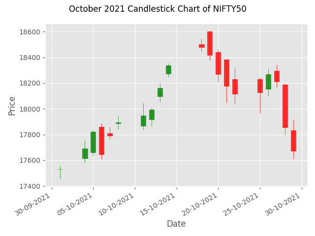
The data has been downloaded from NSE website and stored as october_2021_nse.csv.
To recreate the above graph or a similar graph, use the code below.
import matplotlib.pyplot as plt
from mplfinance.original_flavor import candlestick_ohlc
import pandas as pd
import matplotlib.dates as mpl_dates

plt.style.use('ggplot')

# Extracting Data for plotting
data = pd.read_csv('october_2021_nse.csv')
ohlc = data.loc[:, ['Date', 'Open', 'High', 'Low', 'Close']]
ohlc['Date'] = pd.to_datetime(ohlc['Date'])
ohlc['Date'] = ohlc['Date'].apply(mpl_dates.date2num)
ohlc = ohlc.astype(float)

# Creating Subplots
fig, ax = plt.subplots()

candlestick_ohlc(ax, ohlc.values, width=0.6, colorup='green', colordown='red', alpha=0.8)

# Setting labels & titles
ax.set_xlabel('Date')
ax.set_ylabel('Price')
fig.suptitle('October 2021 Candlestick Chart of NIFTY50')

# Formatting Date
date_format = mpl_dates.DateFormatter('%d-%m-%Y')
ax.xaxis.set_major_formatter(date_format)
fig.autofmt_xdate()

fig.tight_layout()

plt.show()
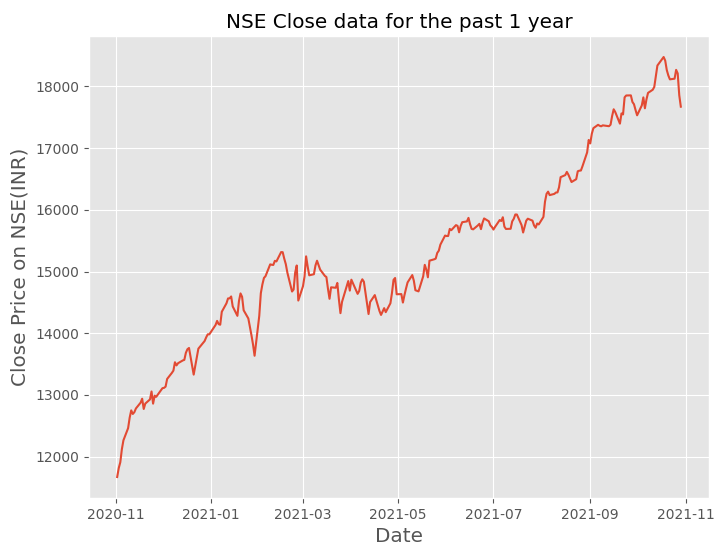
Timeseries
Timeseries charts represent the evolution of a numeric value over time. They are used in the field of statistics, signal processing, pattern recognition, econometrics, mathematical finance, weather forecasting etc.
The below plot shows the Close price of NIFTY50 index over the last one year period.
To create the above timeseries plot, use the code below.
import matplotlib.pyplot as plt
import pandas as pd
import matplotlib.dates as mpl_dates

plt.style.use('ggplot')

# Extracting Data for plotting
data = pd.read_csv('last_year_nse.csv')
data["Date"] = pd.to_datetime(data["Date"])

date = data["Date"]
value = data["Close"]

fig, ax = plt.subplots(figsize=(8, 6))
ax.plot(date, value)
plt.title("NSE Close price for the past 1 year", fontsize="x-large")
plt.xlabel("Date", fontsize="x-large")
plt.ylabel("Close Price on NSE(INR)", fontsize="x-large")
plt.show()
Histograms
Histogram shows the frequency distribution of any given variable. For example - distribution of height of students in a school. The values are split into bins. Each bin is represented as a bar.
The below histogram plot goes further to compare the height distribution between male and female students of a school.
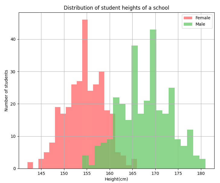
To recreate the above plot or to create a similar one, use the code below.
import numpy as np
import matplotlib.pyplot as plt

total_samples = 300

#female dataset
muf, sigmaf = 155, 4
xf = np.random.normal(muf, sigmaf, total_samples).astype(int)

# the histogram of the data
n, bins, patches = plt.hist(xf, 20, facecolor='#ff6466', alpha=0.75, label='Female')

#male dataset
mum, sigmam = 168, 6
xm = np.random.normal(mum, sigmam, total_samples).astype(int)

# the histogram of the data
n, bins, patches = plt.hist(xm, 20, facecolor='#64c866', alpha=0.75, label='Male')


plt.xlabel('Height(cm)')
plt.ylabel('Number of students')
plt.title('Distribution of student heights of a school')
plt.grid(True)
plt.legend()
plt.show()
Heatmap
A heatmap is a graphical representation of data where each value of a matrix is represented as a color. It shows magnitude of a KPI as color in two dimensions.
For example, the below heatmap shows the cohort analysis of Stripe Monthly Recurring Revenue(MRR) for a company. Each square represents the revenue retained in successive months from the starting month mentioned on the y axis.
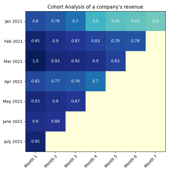
To recreate a similar plot, use the code below.
import numpy as np
import matplotlib
import matplotlib.pyplot as plt

dates = ["Jan 2021", "Feb 2021", "Mar 2021", "Apr 2021",
              "May 2021", "June 2021", "July 2021"]

month_num = ["Month 1", "Month 2", "Month 3", "Month 4", "Month 5", "Month 6", "Month 7"]

stripe_cohort = np.array([[0.8, 0.76, 0.7, 0.5, 0.45, 0.43, 0.4],
                    [0.95, 0.9, 0.87, 0.83, 0.79, 0.78, 0.0],
                    [1, 0.93, 0.92, 0.9, 0.83, 0.0, 0.0],
                    [0.82, 0.77, 0.76, 0.7, 0.0, 0.0 , 0.0],
                    [0.93, 0.9, 0.87, 0.0, 0.0, 0.0, 0.0],
                    [0.9, 0.88, 0.0, 0.0, 0.0, 0.0, 0.0],
                    [0.95, 0.0, 0.0, 0.0, 0.0, 0.0, 0.0]])


fig, ax = plt.subplots()
im = ax.imshow(stripe_cohort, cmap="YlGnBu")

#Show all ticks
ax.set_xticks(np.arange(len(month_num)))
ax.set_yticks(np.arange(len(dates)))
#Show all labels
ax.set_xticklabels(month_num)
ax.set_yticklabels(dates)

# Rotate the tick labels and set their alignment.
plt.setp(ax.get_xticklabels(), rotation=45, ha="right",
         rotation_mode="anchor")

# Loop over data dimensions and create text annotations.
for i in range(len(dates)):
    for j in range(len(month_num)):
        text = ax.text(j, i, stripe_cohort[i, j],
                       ha="center", va="center", color="w")

ax.set_title("Cohort Analysis of a company's revenue")
fig.tight_layout()
plt.show()
Conclusion
I hope this article has helped improve your plotting skills in Matplotlib. If you want to start out as Business Intelligence Specialist or a Data Analyst, having such visualization skills will help you a lot in progressing your career.
Remember - Numbers are boring. What makes them interesting is the story behind.


